Visualizing Semantic Markup in BnF Ms. Fr. 640
Create quick visualizations of a digital scholarly edition with Python
Overview
Data-rich scholarly editions contain valuable editorial annotations one can extract, analyze, and visualize for all sorts of scholarly purposes. This is the case of Secrets of Craft and Nature in Renaissance France, released in 2020, and which makes its metadata file available to download from its GitHub repository. In this post, I show how to gather all these variables in a correlation matrix and visualize them in different ways.
The data
The Making and Knowing Project generates a spreadsheet containing updated information about the manuscript’s contents: entry_metadata.csv. The file can be retrieved from the Making & Knowing GitHub repository. Alternatively, one can generate tailored .csv files, addidng more markup thanks to Matthew Kumar’s excellent manuscript-object, a Python version of BnF Ms. Fr. 640.
Setting up Python
We’ll use Pandas for data wrangling, Matplotlib and seaborn for the heatmaps, and finally NetworkX to produce a correlation-based networks.
For this type of variables, we’ll avoid the Pearson method, and use instead the 𝜙𝐾 method. Make sure you read about this correlation method and PhiK, its corresponding library.
#install packages
pip install phik

# import modules
import pandas as pd
import matplotlib.pyplot as plt
import seaborn as sns
import networkx as nx
Prepare the data
First, let’s download the edition’s latest metadata file from their GitHub repository in the metadata folder.
We’ll select only the columns we need. For this demonstration, I choose all the semantic tags from the English translation tl, but you can also choose tags from the French transcription tc, or the normalized version tcn.
The data comes into semicolon-separated values, and we need Python to count them for us. So we’ll use the stack-unstack method to do so with the regular expression [^;\s][^\;]*[^;\s]*.
To make the matrix more accessible, we rename each column. You can skip this step if you’re in a rush, just bear in mind that our dataframe, at this stage is named tagsrn.
# load the edition's metadata
df = pd.read_csv('entry_metadata.csv')

# select the tags you want to correlate
dftags = df[['al_tl', 'bp_tl', 'cn_tl', 'df_tl', 'env_tl', 'm_tl', 'md_tl', 'ms_tl', 'mu_tl', 'pa_tl', 'pl_tl', 'pn_tl', 'pro_tl', 'sn_tl', 'tl_tl', 'tmp_tl', 'wp_tl', 'de_tl', 'el_tl', 'it_tl', 'la_tl', 'oc_tl', 'po_tl']]

# count comma separated values
tagcount = dftags.stack(dropna=False).str.count(r'[^;\s][^\;]*[^;\s]*').unstack()

# rename columns
tagsrn = tagcount.rename(columns={'al_tl': 'animals', 'bp_tl': 'body parts', 'cn_tl': 'currency', 'df_tl': 'definitions', 'env_tl': 'environment', 'm_tl': 'material', 'md_tl': 'medical', 'ms_tl': 'measurement', 'mu_tl': 'music', 'pa_tl': 'plant', 'pl_tl': 'toponym', 'pn_tl': 'person', 'pro_tl': 'profession', 'sn_tl': 'sensory', 'tl_tl': 'tool', 'tmp_tl': 'temporal', 'wp_tl': 'weapons', 'de_tl': 'German', 'el_tl': 'Greek', 'it_tl': 'Italian', 'la_tl': 'Italian', 'oc_tl': 'Occitan', 'po_tl': 'Poitevin'})
Correlate
Once the dataframe is clean, we can move on to calculate the correlation coefficients between each variables. It’s important at this stage to understand your data, and to make sure you use the most appropriate correlation method. The package pandas-profiling is particularly helpful for this task.
# calculate correlation coefficient with the phi k method
cortag = tagsrn.phik_matrix()
cortag is our correlation matrix. We can now try different types of visualization.
Visualize
The first thing we can try is to visualize it as a color-encoded matrix, using the heatmap module from seaborn.
Correlation heatmap
f, ax = plt.subplots(figsize=(16, 14))
ax = sns.heatmap(cortag, linewidths=.03, vmin=0, cmap="Oranges", square=True)
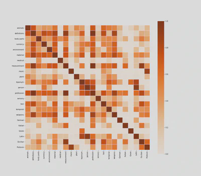
If you know the text well, you can immediately see that the heatmap makes a lot of sense. For example, names are strongly correlated to Latin, as it was customary, especially among 16th-century humanists, to Latinize them.
Some people may argue that this heatmap is merely stating the obvious. They are not entirely wrong, and at first sight, medical tags look like a case in point, as they predictably correlate with body parts, measurements and plants.
But if we read the heatmap more carefully, line by line, we may find some interesting and unexpected correlations. That medical tags, for example, are correlated with Italian and Latin words, gives us some clues about the origin of medical recipes in Ms. Fr. 640. Similarly, the correlation between professions, definitions, and measurements, shows the extent to which professional identity structures 16th-century technical discourses.
Correlation Clustermap
Heatmaps are helpful in “exploratory” contexts, but they may look a bit messy to your audience, especially if you’re discussing–or still looking for–specific semantic clusters in the manuscript. Seaborn’s clustermap module may offer interesting results.
clustermap = sns.clustermap(cortag, figsize=(12, 13), dendrogram_ratio=(.1, .2), vmin=0, cmap="Oranges", cbar_pos=(-.06, .12, .03, .68))
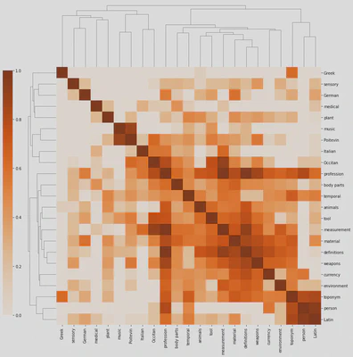
Besides looking like a pixelated (yes, it’s on the OED) insect, the clustermap clearly distinguishes isolated tags (on the top and left) from those that are more interconnected. We also distinguish isolated clusters, such as music and Poitevin (who would have thought!), from more central ones such as mesaurement, material, definitions and weapons. Professions are more interconnected, but they’re not part, at least in this specific correlation matrix, of a particular cluster.
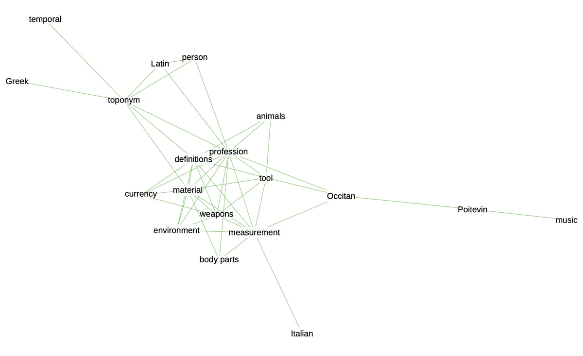
Correlation network
If we want to synthesize even more the correlations contained in our matrix, network graphs offer an elegant solution. This is particularly true in contexts where we want to communicate about the manuscript’s contents.
In order to do this, we need to change our matrix into a list of edges and nodes and define a threshold to eliminate weaker correlations from our graph.
# transform the data
links = cortag.stack().reset_index()
links.columns = ['var1', 'var2','value']

# threshold
links_filtered = links.loc[(links['value'] > .6) & (links['var1'] != links['var2'])]
links_filtered

# create edges
G = nx.from_pandas_edgelist(links_filtered, 'var1', 'var2')

# draw network using Kamada & Kawai's algorithm
plt.figure(3,figsize = (12,12))
nx.draw_kamada_kawai(G, with_labels = True, node_color = 'red', node_size = 400, edge_color = 'black', linewidths = 1, font_size = 14)
If there are too many edges and nodes, you can still change the threshold to get a cleaner result. Otherwise, you can export the graph to play with it in Gephi, using the function .write_gexf().
nx.write_gexf(G, 'graph.gexf')
You can see the result at the beginning of this post.
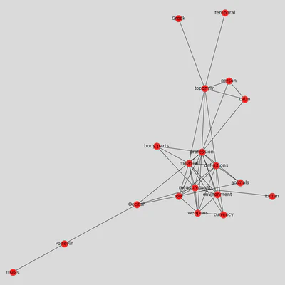
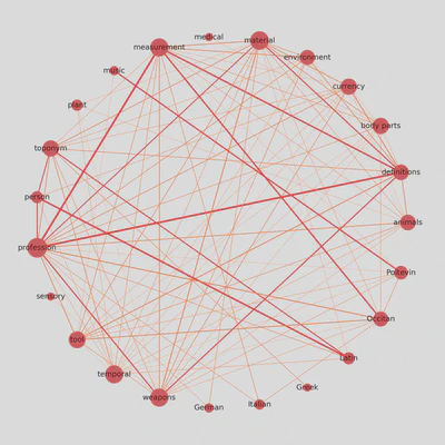
Update: Circular weighted network
I was looking for ways to display correlation matrices as weighted networks, and I found this interesting approach shared by Julian West, which I am adapting here to our dataset.
# create graph weighted by correlation coefficients (unfiltered)
Gx = nx.from_pandas_edgelist(links, 'var1', 'var2', edge_attr=['value'])

# determine a threshold to remove some edges
threshold = 0.4

# list to store edges to remove
remove = []

# loop through edges in Gx and find correlations which are below the threshold
for var1, var2 in Gx.edges():
    corr = Gx[var1][var2]['value']
    #add to remove node list if abs(corr) < threshold
    if abs(corr) < threshold:
        remove.append((var1, var2))

# remove edges contained in the remove list
Gx.remove_edges_from(remove)

print(str(len(remove)) + ' edges removed')
Once we remove a few edges, we can determine their color and thickness.
# determine the colors of edges
def assign_colour(correlation):
    if correlation <= 0.8:
        return '#ff872c'  # orange
    else:
        return '#f11d28'  # red


def assign_thickness(correlation, benchmark_thickness=3, scaling_factor=3):
    return benchmark_thickness * abs(correlation)**scaling_factor


def assign_node_size(degree, scaling_factor=50):
    return degree * scaling_factor
We also give nodes a size proportional to their number of connections.
# assign node size depending on number of connections (degree)
node_size = []
for key, value in dict(Gx.degree).items():
    node_size.append(assign_node_size(value))
The result is a weighted graph that admits more nodes and considerably more edges, while remaining readable and informative.
Clément Godbarge
Lecturer in Digital Humanities
My research interests include early modern history, European literature and the digital humanities.